DGAH Midterm : Analyzing Popular Mediums Used in 1980s Art
Introduction
Welcome to my midterm project! For my midterm, I will be analyzing 1980s art collected by Tate. The overall purpose of this project was to visualize the most popular mediums used in the 1980s. To do this, I used Google Sheets and Excel to sort and filter the data for my project.
Processes
Looking at the original data set, I was overwhelmed by how many different attributes there were. With over 2400 artworks with 18 attributes made by different artists, I wanted to focus on attributes with frequency and not too many different categories. Two attributes came across, dates (years) and medium. First, I deleted everything but the medium and years on Google Sheets. I exported this data onto OpenRefine to fix any spelling errors and merged clusters. This made sure to not leave out any artwork to get the most accurate data set. There were still over 500 different mediums which was too many so decided to focus on the popular mediums by getting rid of mediums used less than 10 times. I wanted to filter out artworks on OpenRefine as well but I couldn’t figure out a way. I went back to Google Sheets, ordered the mediums alphabetically and deleted mediums that didn’t appear more than 10 times in a row manually. This left me with the 29 most used mediums. To get the number of frequencies of each medium in each year, I transferred the filtered data into excel and made a pivot table. This created my final new data set with mediums, years, and frequency. While this entire procedure could have been more efficient if I had been able to filter the data solely in OpenRefine, I successfully got the results I needed using Excel.
Sources
The data set that I used was given by Professor Saladin. Here is the original data set before any cleaning & formatting.
Presentation
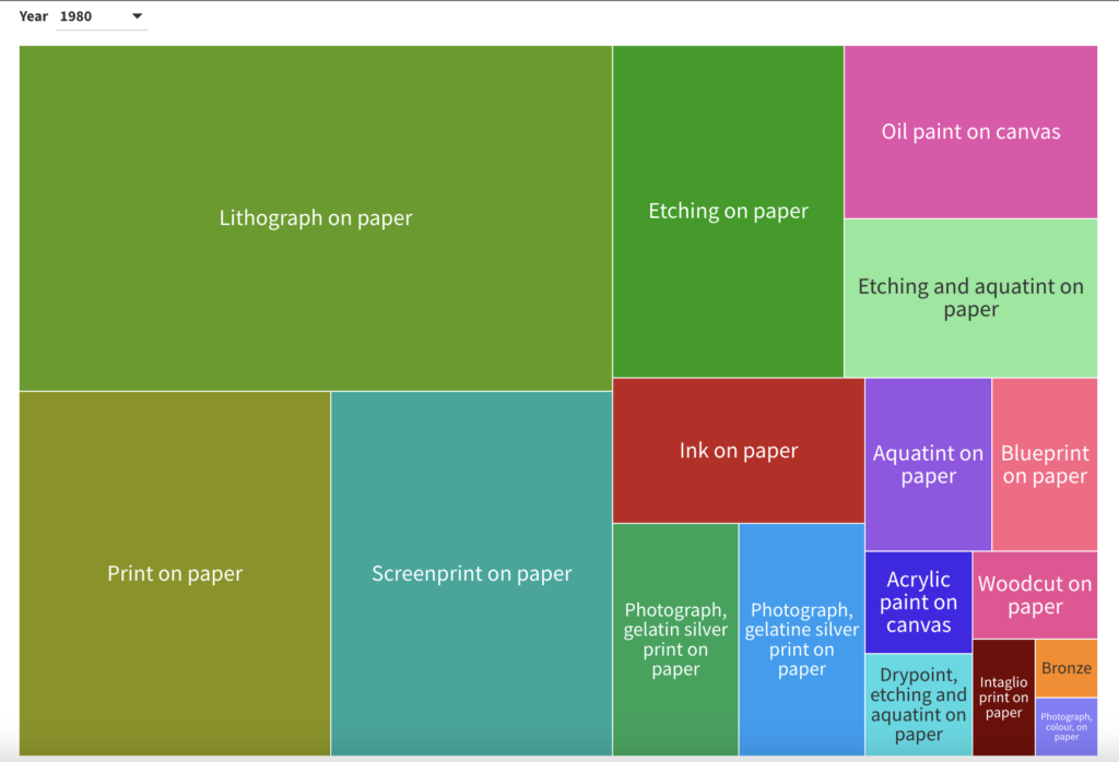
Here is the treemap that I made using Flourish. Using a treemap is a way to represent information in a hierarchical structure through the use of rectangles, where the size and arrangement of each rectangle convey specific data attributes. As you can see the most popular medium is the largest rectangle on the top left corner. This descends down diagonally to the opposite bottom right corner of the map. By hovering over the rectangle, the exact number of artworks using the medium shows on screen. There is a “Year” button that users can use to change the year from 1980 to 1989. The rectangles and medium will change according to the year chosen. This simplistic yet effective map is just what I wanted to visualize my data.
Significance
The analysis of popular mediums used in 1980s art, as conducted in this project, provides valuable insights into the artistic trends and cultural context of that era. It allows us to connect the choices of materials and techniques to the rise of various artistic movements Furthermore, it showcases the evolution of different art forms, including the use of photography and digital art, reflecting the period’s embrace of new technologies and ideas. However, it’s important to acknowledge potential pitfalls, such as the exclusion of less common but innovative mediums and the limitations of a purely quantitative representation. In essence, this analysis offers a meaningful snapshot of 1980s art, providing a foundation for further exploration and discussion of this time period in the art.
